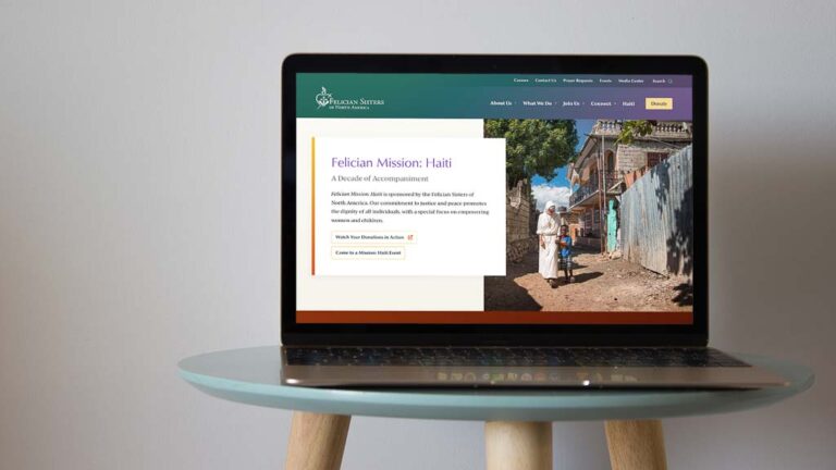
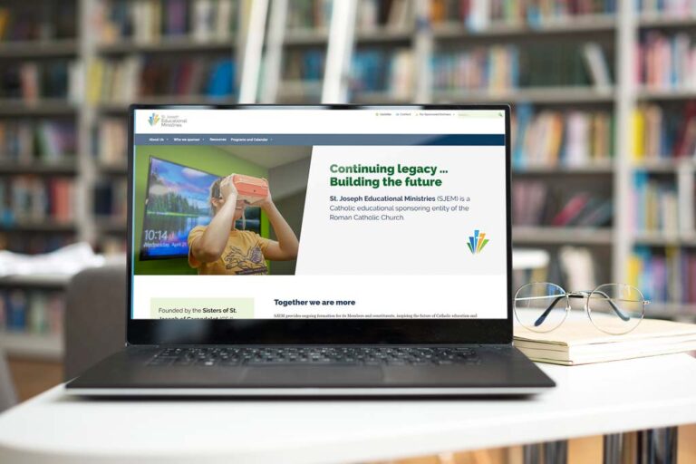
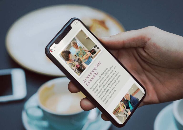
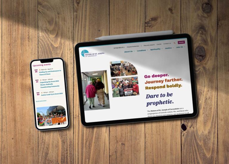
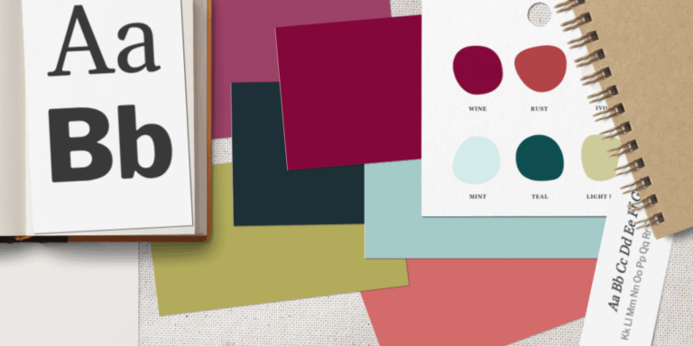
opportunity

Resources:

Case Studies

We‘ve been privileged to work with passionate, creative and kind clients. In these case studies and success stories, learn about what worked for them that could work for you, too.

The sun rising behind a chapel in Assisi

Franciscan Federation website

This member organization needed a sturdy, beautiful online tool to share information and encourage community resources & networking.

A teenager riding a mountain bike at a race

NKY Roots website

We built a bright & welcoming website for this mountain bike team to promote themselves in their community and invite kids to join.

Tablet with colorful CSJCarondelet.org website displayed

CSJ Carondelet website

For this organization in transition, we built a website with clarity and engaging visuals. It beautifully uplifts the congregation and its vibrant facets.

Adorers brand extension

As part of our comprehensive website project with this community of Sisters, we expanded their brand with fresh, usable colors & typefaces.

Jimmy Rinehart identity & website

Vintage guitars and classic vinyl records inspired this identity & website for a hard-working musician to keep fans and venues informed and happy.

Loretto Community logo & brand identity

This religious community had a dated, inconsistent look. We made them a whole new identity that’s organic, inviting, colorful, and super usable.

Sisters of Providence website redesign

We helped this congregation completely re-think and re-organize their sprawling website. Then, we built them a fresh, vibrant new look. The result is a welcoming, enjoyable, and inspiring online home.

A clipboard with logo and color palette information for Ravel, showing some typical brand identity takeaways.

Ravel Studio Pilates identity & website

For a business moving from a side-hustle to a full-time-gig, we designed a complete brand system and a modern, professional website that will enable Katherine to grow her Pilates business to new heights.

New Lights from Old Truths book cover

For this history book, we combined engaging images from the past with bold, fresh design elements to create something readers will want to pick up and buy.

Some of the WordCamp Nashville 2016 crew, with volunteer bandanas matching the conference branding.

WordCamp Nashville event branding and materials

For this community-run tech conference, we provided a colorful, recognizable identity, and applied it to perfectly branded promo, swag, and event materials.

th’ poetry asylum identity & flyer

We made a playful, zine-like logo set and flyer for this community organization of poets and writers. It’s edgy, eye-catching and super usable.

“The Wabash, Volume II” album art

An arts nonprofit asked us to design this compilation album of local music. We paired evocative images with bold typography for a great final piece.