

Book cover design
Sister Maureen Abbott is a writer, historian, and member of the Sisters of Providence of Saint Mary-of-the-Woods, Indiana. She spent years researching and writing the latest volume of her congregation’s history. Sister Maureen wanted to ensure that her labor of love found readers and conveyed the lively spirit of its content.

Project milestone
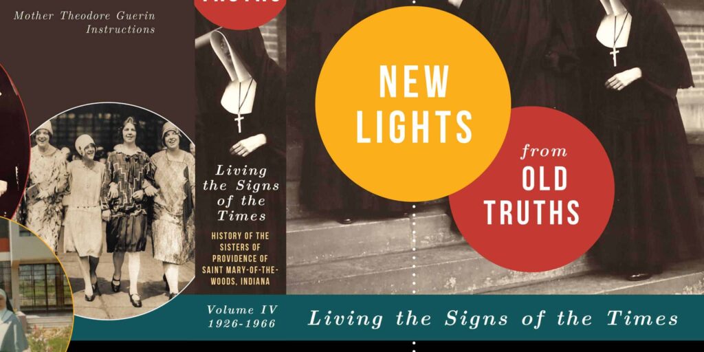
As designer for the Sisters of Providence at the time, Christina brought her own love of reading to the project. First, she selected particular historical photos with personality and engaging faces. Then she combined them with fresh and vivid design elements. To clarify the long title, Christina broke it into shorter pieces, arranging them in order and with a clear hierarchy. The final front cover gives clear, understandable hierarchy to the long book title and information.
Project milestone
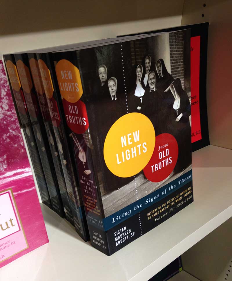
The back of the cover features a quote from the congregation’s foundress from which the book’s title is taken. Christina highlighted the relevant words with their corresponding colors to make the connection clear. Friendly faces in the pictures hint at the book’s contents. Finally, Christina paid special attention to the book’s spine to make sure any discerning library patron would take note.

Project results
The result is a modern book cover that looks eminently readable. It appeals to the hardcore history lovers as well as the casual non-fiction readers intrigued by the stories within. The book’s cover is well-suited to its contents, and it looks great everywhere, from a physical bookstore shelf to its Bookshop.org listing.
Whether you have a project in mind, need a speaker for an event, or just have a question — we'd love to hear from you.