

Website project
The Adorers of the Blood of Christ, United States Region are a community of sisters with a main office in St. Louis, Missouri. The broader ASC family includes their Catholic sisters as well as a variety of opportunities for lay men, women, and youth. The community has a number of ministries, resources, and justice initiatives, as well as a podcast.
Project milestone
First, we asked the Adorers working group (including communications team and a member of leadership) to talk to us about their branding. Favorite parts? Least favorite parts? Strong feelings in any direction?
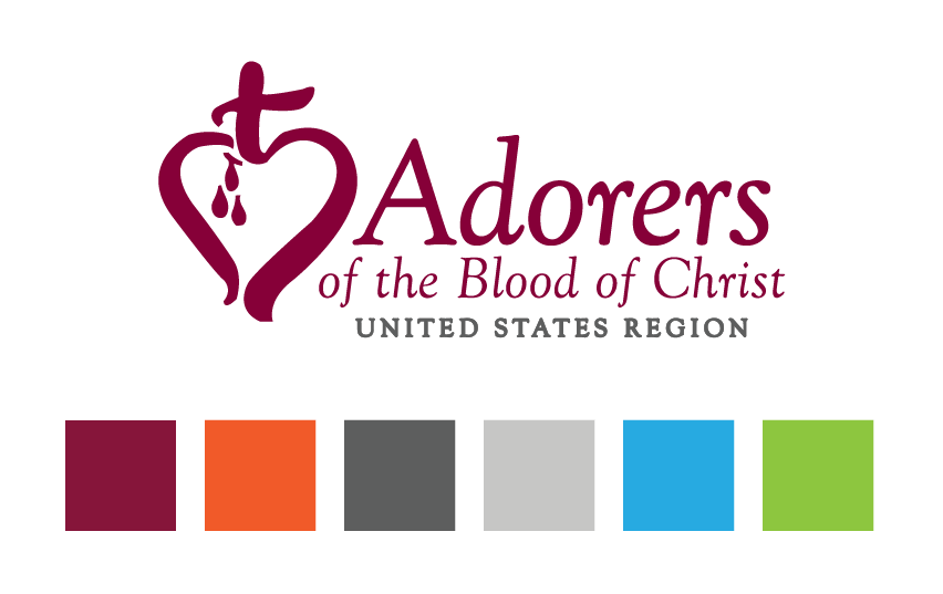
Their answers were illuminating! They didn’t want to make any changes to the logo itself, and they knew that the wine color of the logo was an anchor of their organization. But the other colors in their brand guidelines didn’t feel much like they fit, and weren’t being used much. The team worried that the colors together were loud and overwhelming, and even hard to look at. Additionally, the typefaces were pretty boring when applied to the web.
Starting from their existing use cases, we conducted a brand audit and gathered examples of the brand in use. We looked at a compilation of this audit together, talking about what worked and what didn’t.
Finally, the team was able to land on some goals for their branding on the site. They wanted to
Project milestone
Armed with their feedback & goals (and our knowledge of web needs), we got to work exploring color combinations that would work well with the wine color.
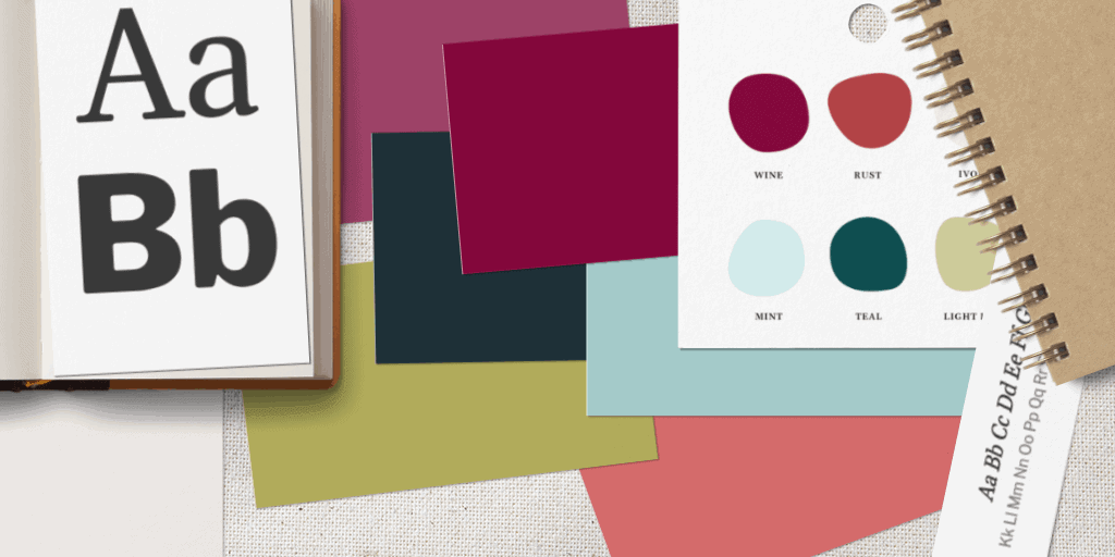
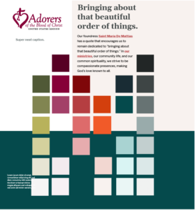
Soon we landed on a fresh, new, natural palette that added mints, greens, and rusts to the mix. Then, we expanded each hue to have lighter and darker versions of the color.
In particular, we expanded the hues out to include dark and light neutrals. We knew that having these tints and shades would come in useful in the website design process. Instead of relying on shades of gray, we could utilize subtle bits of color to delineate sections and highlight certain areas.
The typefaces included in the Adorers’ brand guidelines matched their logo’s fonts. These fonts worked alright in print, but didn’t work as well on websites. We went in search of more readable, web-appropriate typefaces. The new choices felt akin to the previous guidelines, but afforded us more possibilities in web design. They were more clear, more friendly, and more readable online.
Project milestone
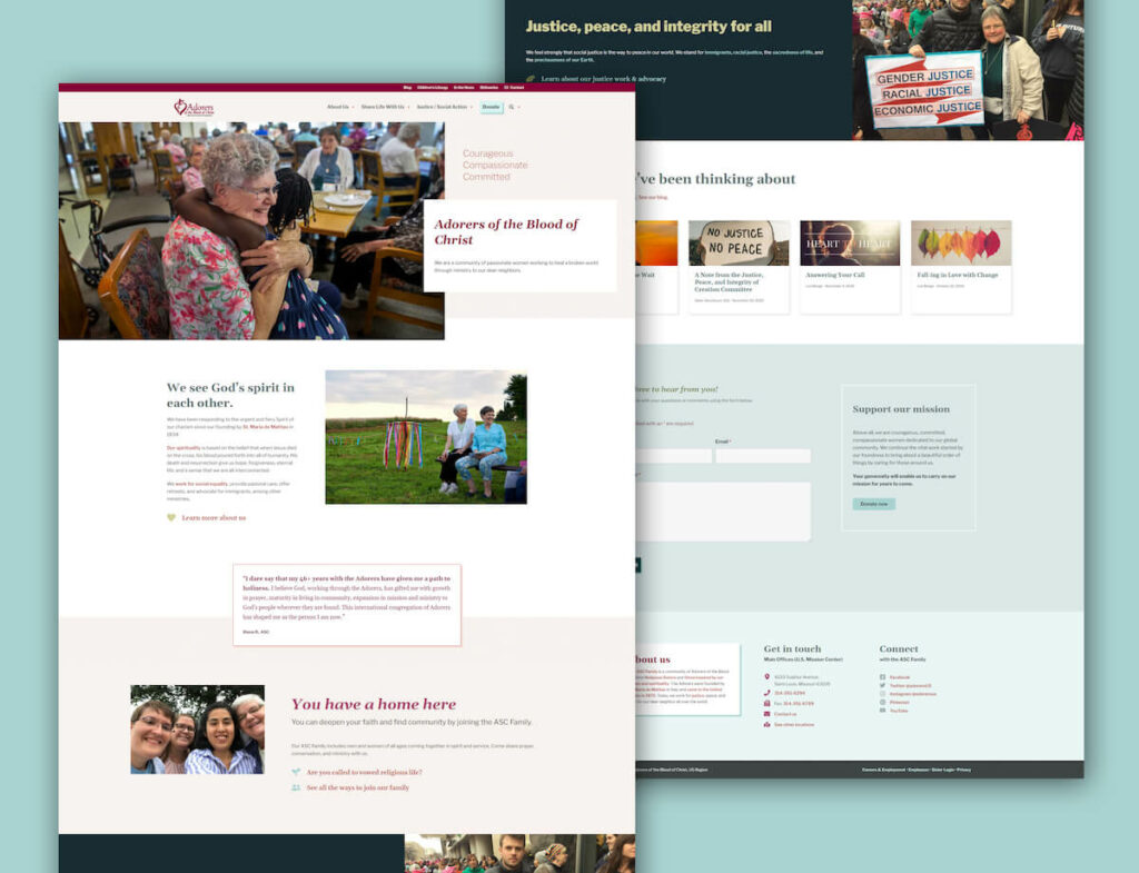
Our comprehensive website project with the Adorers included lots of content strategy, site architecture, and user experience (UX) work. We collaborated with their marketing team to define the content needs of the site, and we educated them on how to get all of this great new information into their new WordPress website.
When we put the strategy together with the brand extension, we were able to apply the expanded color palette and new typefaces to our site design for the Adorers’ public and member sites. The end result is dynamic, friendly, and truly on-brand.

“Christina and Jess brought incredible skill, design aesthetic, organization, patience and good humor to our project. They were our perfect partner, guide, teacher and companion for building two web sites we are now so happy to share.”
Cheryl Wittenauer
Communications Director, Adorers of the Blood of Christ
“Blustery Day Design was a godsend. They were easy to work with, created a beautiful website, and helped us suss out all our content and strategy in a lasting way. Our new site is true to who we are and a beautiful representation of our organization.”
Molly McKinstry
Communications Associate, Adorers of the Blood of Christ
Whether you have a project in mind, need a speaker for an event, or just have a question — we'd love to hear from you.