
Brand identity & website project
The Loretto Community is a non-profit organization of Sisters of Loretto and Loretto Co-members. They have a historical home in Nerinx, Kentucky, but also live and work all over the world in the fields of education, healthcare, elder care, environmental stewardship and advocacy.
Project milestone
The Loretto Community wanted to update, stylize, and standardize their visual identity. The refreshed logo & branding needed to build on Loretto’s signature green color to create a modernized, cohesive visual look and feel. We knew helping the Loretto communications team through a brand identity visioning process would be a worthwhile journey for everyone.
First, we started with a brand audit of the existing logo and graphics. We had Loretto gather all of the various uses of the brand, including on their website, magazine, and other publications.
Additionally, we asked them to gather significant imagery, art, and graphics that had been used to represent the Community out in the world. They gave us a wealth of inspiration! In particular, they included artwork from two talented artists in their community, Sister Jeanne Dueber and Loretto Co-member Bob Strobridge.
Project milestone
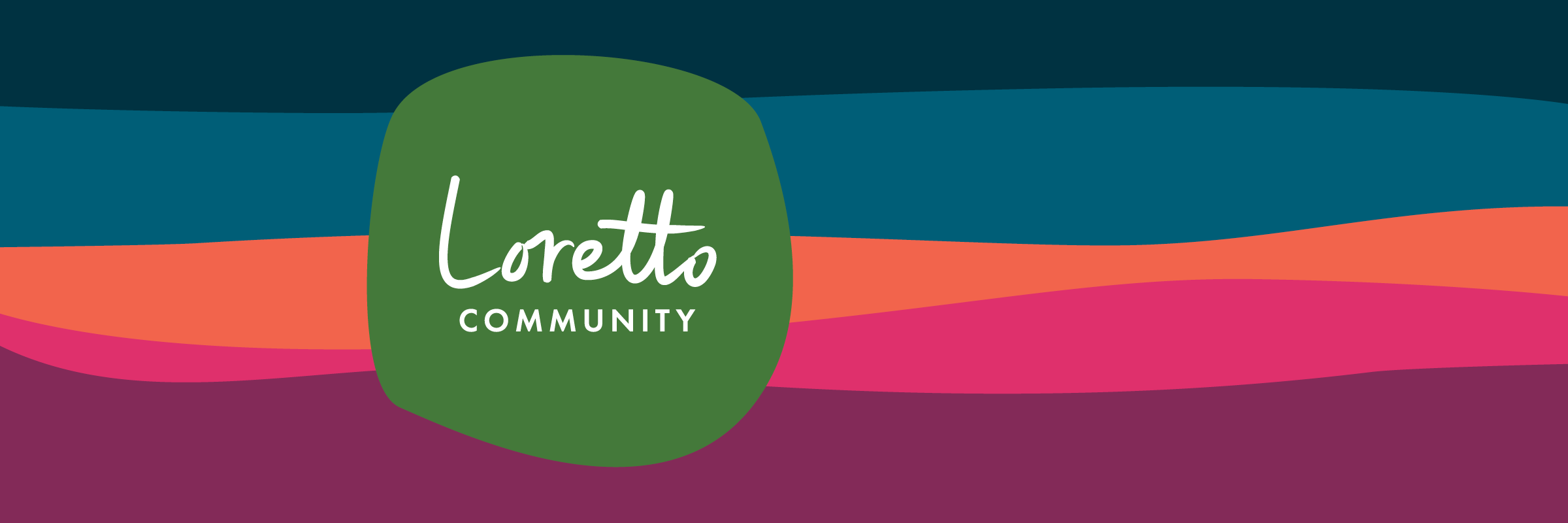
Building on Loretto’s foundations, we designed a new logo in collaboration with the communications team, who sought feedback from a special group of identified stakeholders.
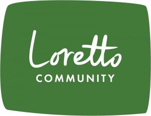
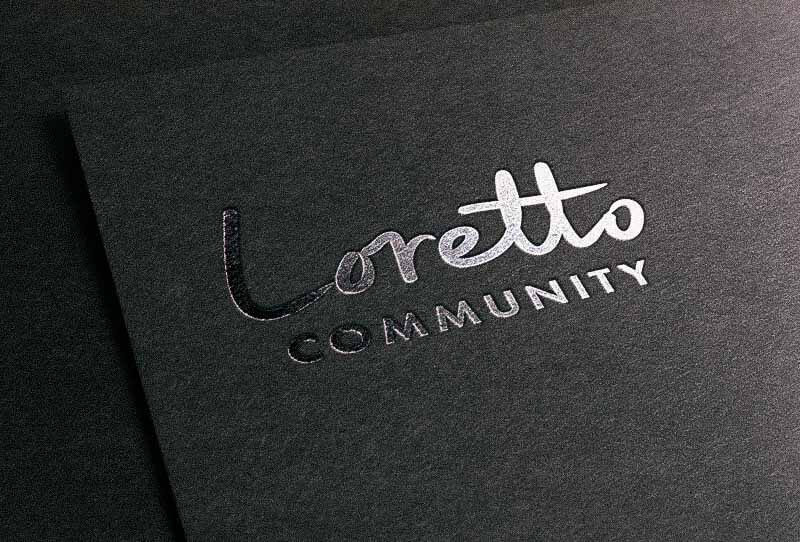
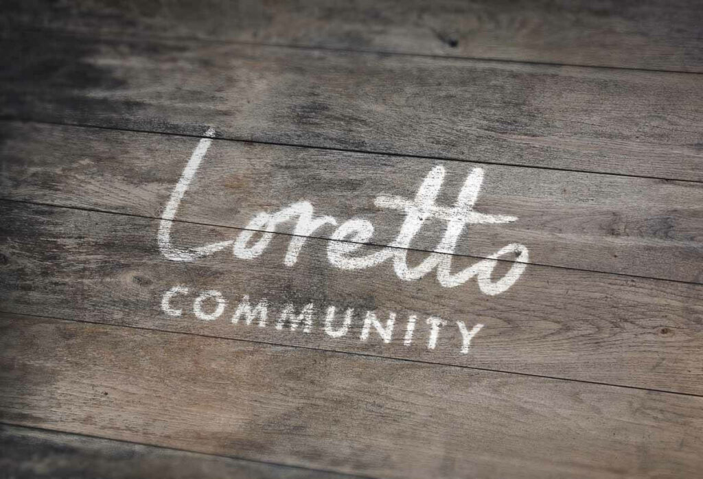
The new handwritten logotype updates the previous branding elements to be natural, inviting, and energetic. The identity balances sophistication and friendliness to reflect the active, diverse Community.
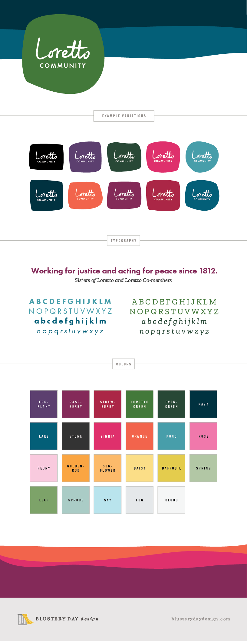
For the logotype itself (“Loretto Community” words), we intentionally created an organic, non-rigid, oval shape with no right angles or harsh corners. We started with a hand-drawn treatment for the word “Loretto,” then carefully refined the letterforms for maximum legibility and personality. Then we added a clean typed “Community” below. Finally, we enclosed it in “hand-cut felt” bounding shapes, inspired by the fantastic cut felt banners created by Bob Strobridge.
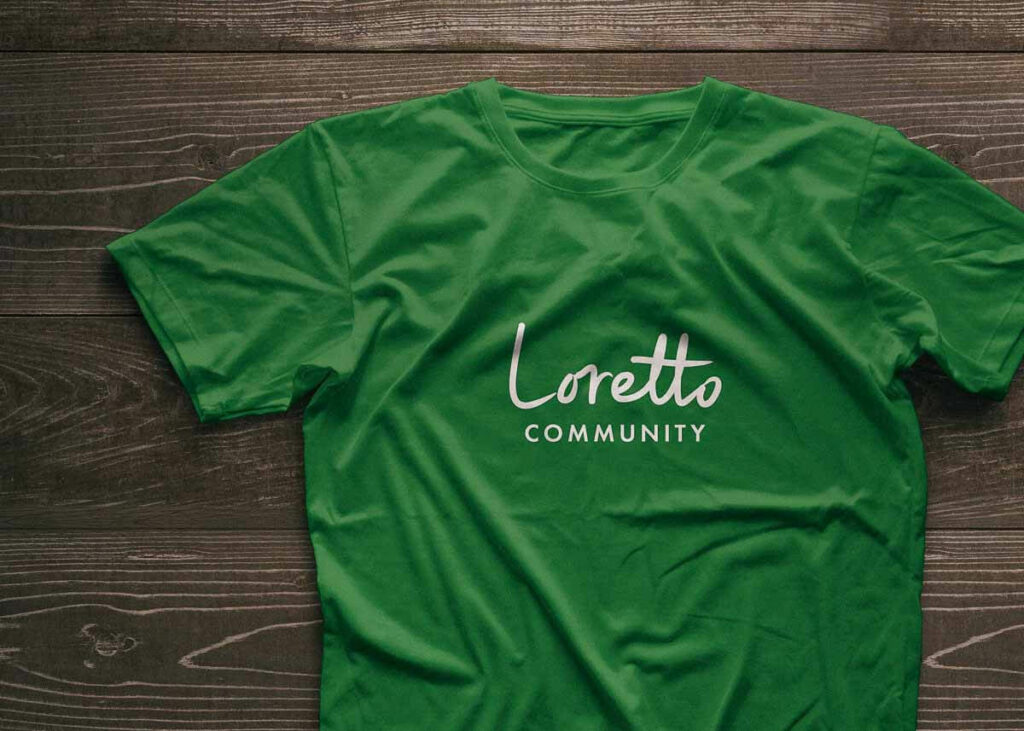
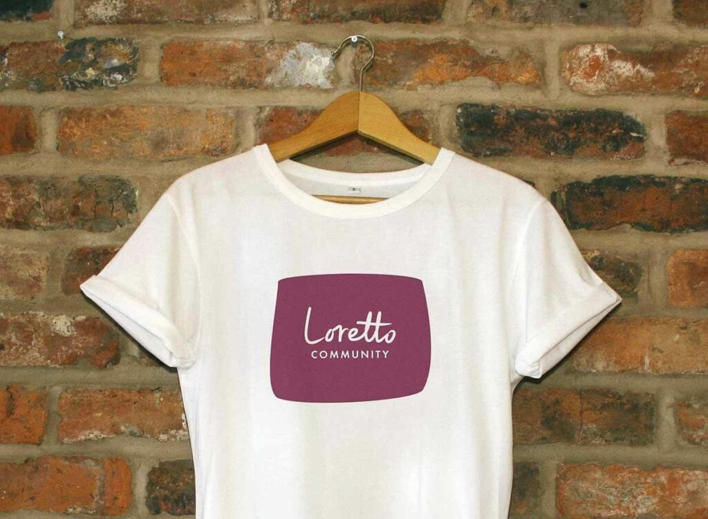
We created a primary “Patch“ logo, featuring the white logotype placed in a Loretto Green patch. But we intentionally left room to play (within reason). These hand-cut felt bounding shapes can be flexible, allowing for a variety of tactile and friendly variations.
The Futura typeface has been used as part of the Loretto Community visual representations for decades. Linking the new logotype to this history, we chose to continue to utilize this font in a modern, legible way.
Project milestone
Loretto Community was not unique in having a single brand color. Like others in this position, they struggled with how to use the brand online and in printed pieces. We knew an expanded color palette was necessary to bring the logo into a beautiful, branded context.
The vibrant color palette is inspired by the spirit of Loretto’s people and places! We pulled hues directly from the Community’s banners and their Motherhouse grounds. Then we carefully chose colors that could integrate the “Loretto Green” of the past into a fresh, expanded palette. The result is super usable for both digital and print pieces.
The identity, color palette, and hand-cut felt edges are ready to transfer perfectly to a variety of web uses and digital graphics. And possibilities for print pieces, digital newsletters, and other physical applications are endless!
Since we were also working with the Loretto Community on two big website redesigns, we included a variety of tints and neutrals that could properly expand the brand identity to web use.
In particular, we paid close attention to the contrast ratios of these colors in combination. In the brand guide we provided at the end of the project, we included a comprehensive chart to indicate which colors could be used together to be read clearly and meet accessibility standards.
Project milestone
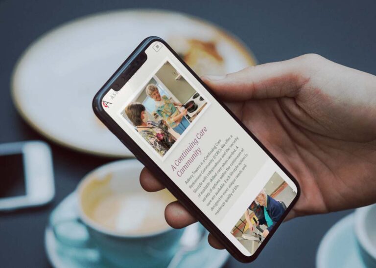
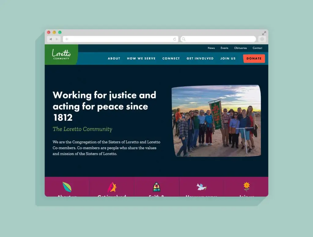
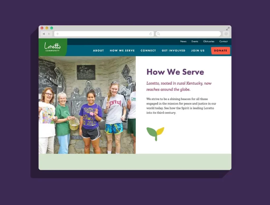
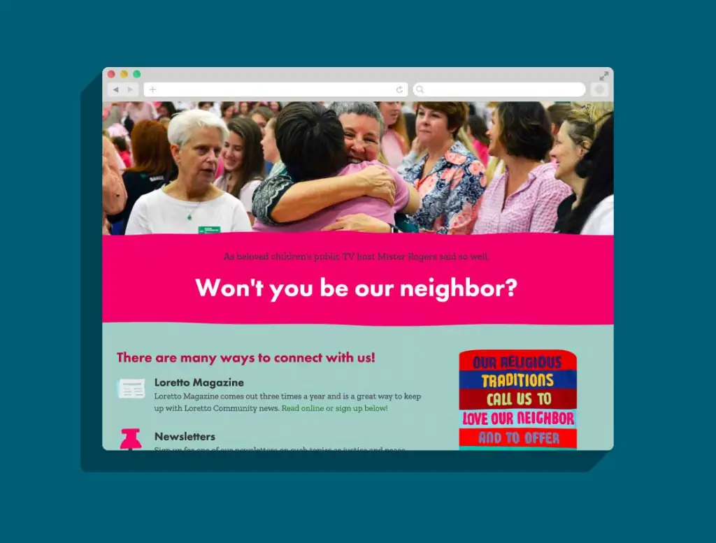
Our comprehensive website project with the Loretto Community included lots of content strategy, site architecture, and user experience (UX) work. We collaborated with their marketing team to define the content needs of the site, and we educated them on how to get all of this great new information into their new WordPress website.
When we put the strategy together with the brand new logo & identity, we were able to create a vibrant, welcoming site design for Loretto’s public and member sites. The end result is dynamic, friendly, and truly inline with the spirit of the community.
“Hands down, BDD is the best team with whom I’ve had the opportunity to work. Jessica and Christina are amazing! They are brilliant, creative and thorough, and ask the best questions to really understand the scope and purpose of what we need, while always being mindful of the best fit for our users and our budget. They are creative problem solvers extraordinaire, and it’s simply a joy to work with them.”
Rebecca H.
Webmaestra, Loretto Community
Whether you have a project in mind, need a speaker for an event, or just have a question — we'd love to hear from you.