
Album art
Wabash Valley Art Spaces is an arts non-profit that commissions and places art in public places in Terre Haute, Indiana. They provide public art to “enhance economic growth, enrich cultural experiences, and build a legacy for future generations.”
To raise money for this public art, they coordinated a series of compilation albums. They asked local musicians to provide songs (original or cover) about the local Wabash River.
Project milestone
We started with some supplied photos, and added a photo Christina had taken of the Wabash River on a foggy day. Then we found a few additional relevant photos in our collection. Finally, we found some old public domain maps of Indiana that included the twisting Wabash River.
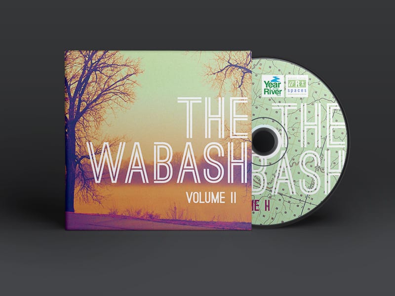
All of the pictures we’d gathered were nice, but they didn’t look nice together. They all had different color schemes and moods, and in combination look slap-dash. So we carefully color graded these images in a unique, evocative way to create a cohesive, modern set.
Project milestone
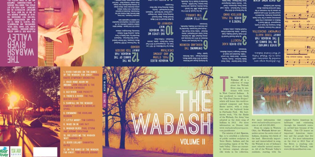
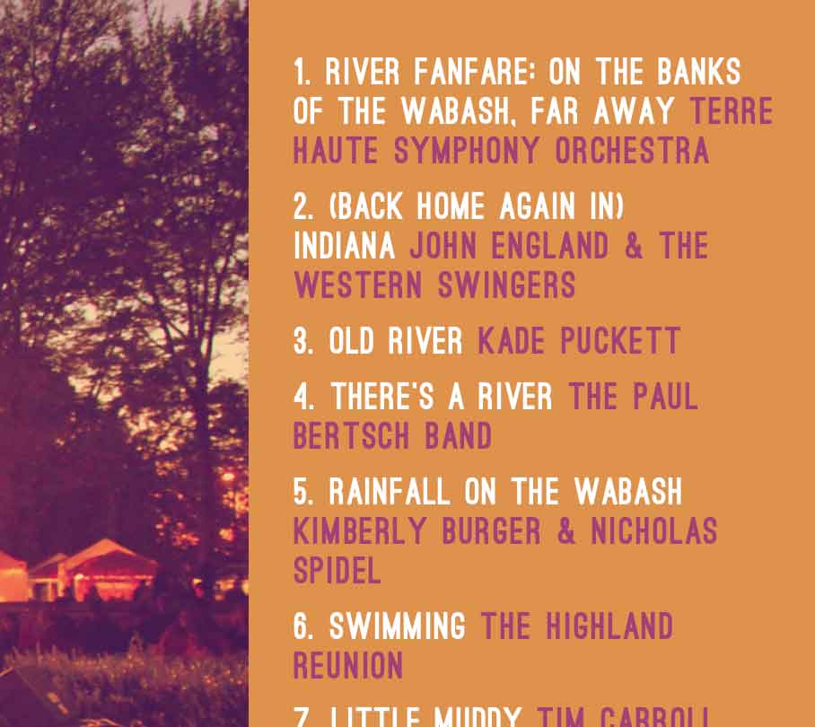
Art Spaces supplied us with some photos, a smattering of Word docs, and loose copy in emails. And the album’s producer, Don Arney, gave us track information. We sorted through the big pile of copy and organized it all into clear sections. Then we distributed them throughout the six-panel eco-wallet. We used an attractive color palette that matched our color-graded images.
By utilizing clear hierarchy of information and creative typographical standards, we made sure the final result was understandable and engaging.
We gave careful consideration to each panel of the wallet, including the spine, so the listener’s full experience with the physical album will be a positive one. And though sometimes the disc itself is seen as an afterthought in a design, we always like to give it special care. For The Wabash, Volume II, we paired a color-graded river map with a bold bleeding-edge type treatment.
Spotlight on
In particular, we focused on giving the album clear credit information. We are big advocates of crediting everyone who contributes to a project and of citing sources. So we separated song-level credits from album-level credits, and then laid out the text consistently.

“We want you to know how much we appreciate your lovely and energetic design work and that we are grateful to you for hanging in with us during this whole process.”
Wabash Valley Art Spaces board
Whether you have a project in mind, need a speaker for an event, or just have a question — we'd love to hear from you.