Event branding & materials
WordCamp is a community-run WordPress conference, held yearly in dozens of cities around the world. For Nashville’s 2016 conference, the planning team wanted a unique visual identity that would make them stand out from the other WordCamps. They wanted it to feel like Nashville without being cliché about it, and they knew they’d need all sorts of items design — from advertisements to promo pieces to swag to signage.
Project milestone
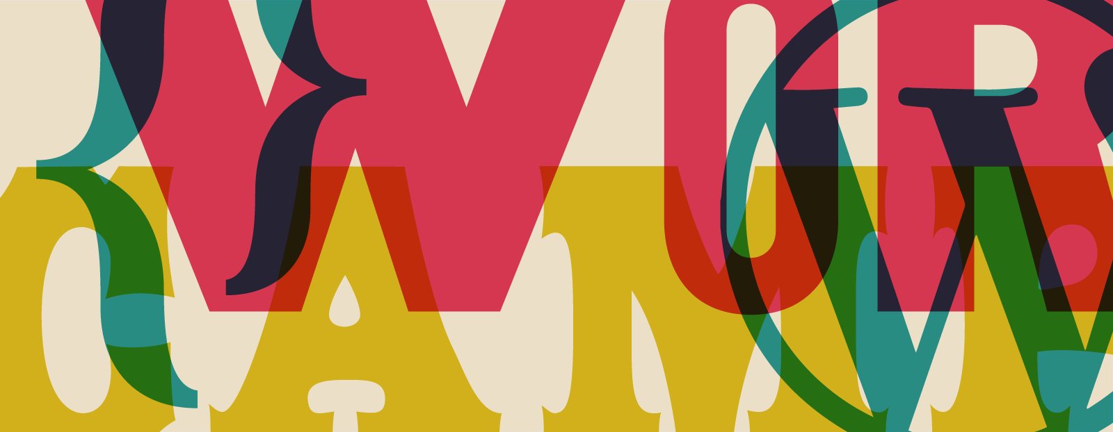
At Blustery Day Design, we volunteer our services when possible, and Christina was excited to step in as design lead for the conference. With the help of the planning team and other leads, we created a colorful identity based on the classic printmaking style of Nashville music posters.
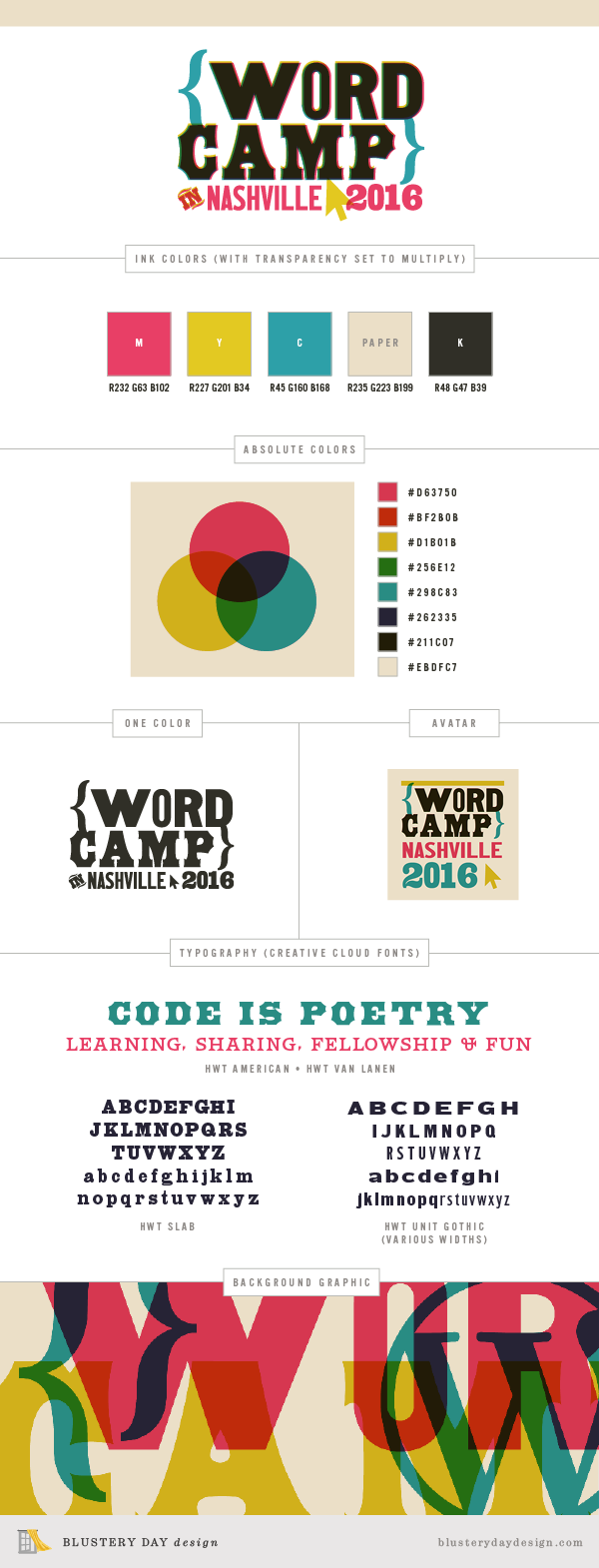
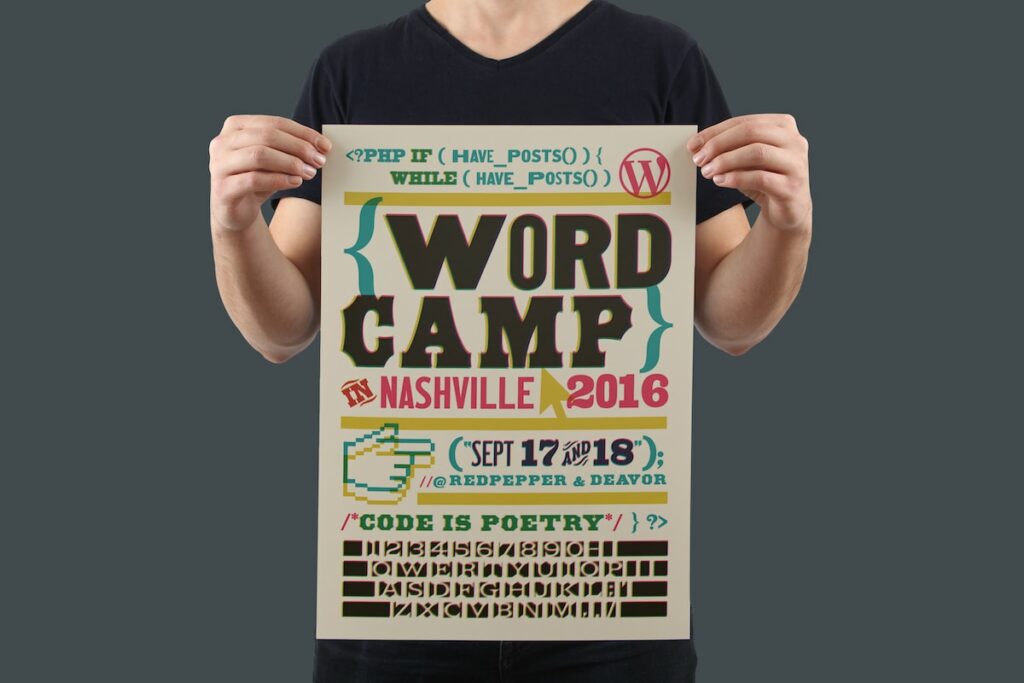
We started with a CMYK ink-overlay style and color palette. Then we incorporated some of the visual cues of WordPress programming, like brackets, PHP code language, and the arrow & hand pointers. The fun, recognizable identity translated well to everything the #wcnash team needed, and the final conference materials were whimsical, welcoming, and vibrant.
The WordCamp Nashville identity includes a logo with variations, plus typography indications, a color palette, and a variety of graphic elements to use as needed. And we provided a comprehensive branding style guide so the colors and typefaces could be used consistently by all of the planning crew members.
Project milestone
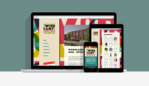
We applied the WordCamp Nashville brand to a custom website design that looks great on all screen sizes. The site is bright, inviting, and representative of the spirit of the community.
Spotlight on
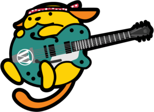
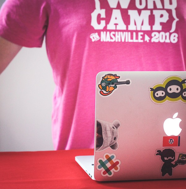
The Wapuu is the official mascot of the WordCamps worldwide, and many camps create their own version. We drew this little guy with a country gentleman guitar and a Willie Nelson bandana. The result is a Wapuu that is iconically Nashville. He looks great in web use, print, and in the enamel pins made for volunteers.
Project milestone
Pre-conference, WordCamp Nashville needed a variety of promotional pieces. We extended the logo into a poster-style graphic, utilizing a cheeky letterpress/WordPress programming code combo. This graphic was also used as a promotional postcard, with additional information on the reverse, that the team scattered around town at coffee shops and libraries.
Project milestone
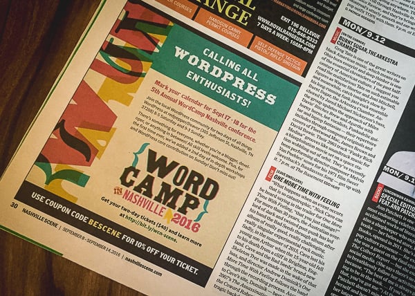
For advertising, we designed an eye-catching, on-brand ad to run in the weekly Nashville Scene, which is distributed all over Nashville. We made sure to include all of the information a potential attendee would need to take the next step and register for the conference.
Project milestone
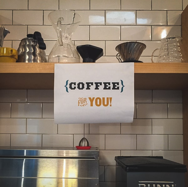
For the day of the conference, the team needed a variety of informational materials. We knew that this was an opportunity to provide clarity for event attendees. And that we could help set the mood of the space with colorful, creative materials.
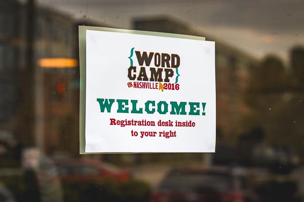
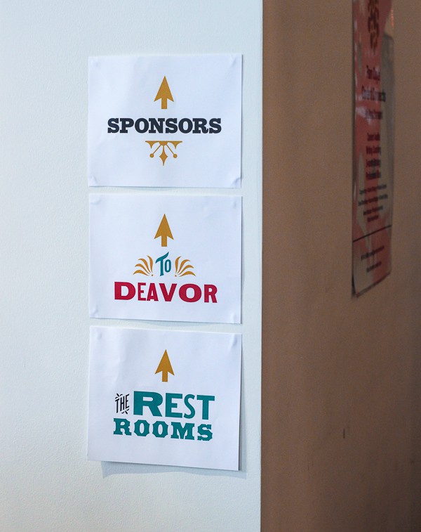
First, we designed directional signage to ensure that attendees felt welcome and knew where to go. We incorporated the brand colors and fonts with printmaking motifs to add a fun touch. To keep costs low for the community-run event, we designed these signs to be printable on a standard color laser printer on letter-size paper.
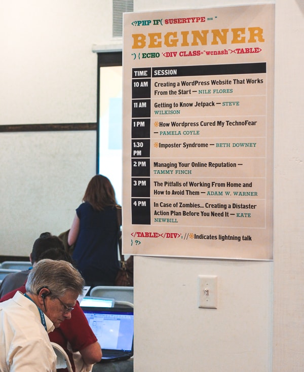
Then, we made large-scale schedule posters for display outside of each room. By including design details but focusing on clarity, we made sure the information was conveyed effectively. The helpful signs kept everyone on track.
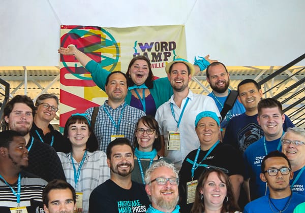
Spotlight on
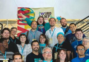
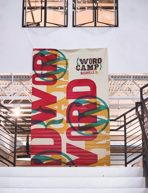
As a way to intentionally set the scene, we also designed a large-scale banner to hang at the venue. Bright and exciting, it hung in a big open stairwell area at the center of the space. Attendees loved taking group selfies in front of it, too!
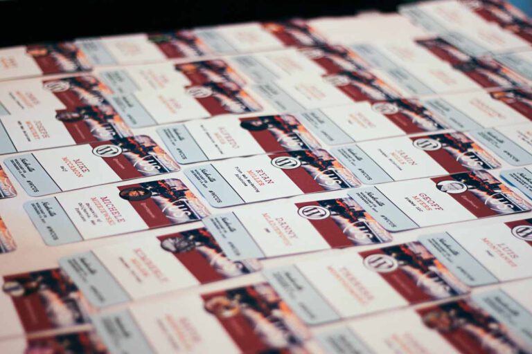
Project milestone
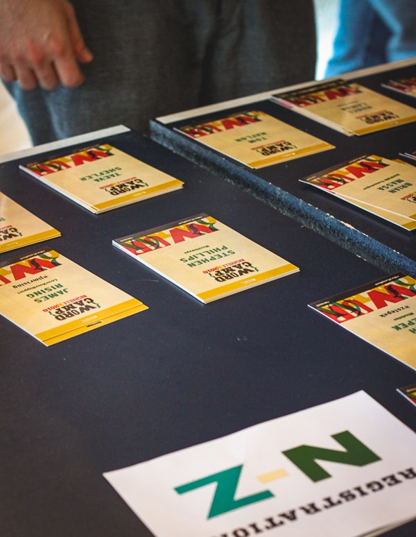
Each attendee needed a name badge with the event schedule on the back. We love designing these! It’s a great opportunity to carry the colors and brand throughout the attendees themselves. And it gives folks a nice takeaway to hang near their desk when they get home.
We designed a sophisticated template that allowed for data merge of attendees’ names, companies, and twitter handles. We then imported all of this information from a spreadsheet and fine-tuned the results. Instead of being boring and mechanical, this data is displayed in colorful typography. These personal touches made attendees feel welcome and pumped for the day.
Project milestone
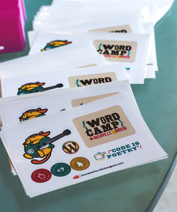
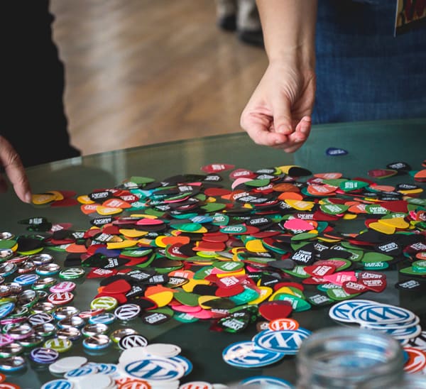
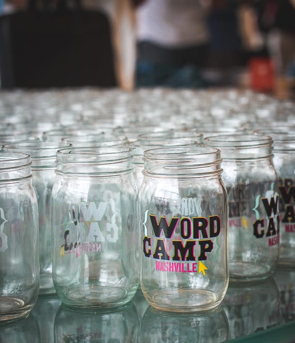
WordCamps are known for their fun gifts for attendees. For WordCamp Nashville 2016, we first designed a sticker sheet featuring brand elements and the Wapuu we had drawn. Then we set up multi-colored guitar pics and mason jars (two Nashville standbys!) to be branded with the conference motif. Everything was a hit.
Project milestone
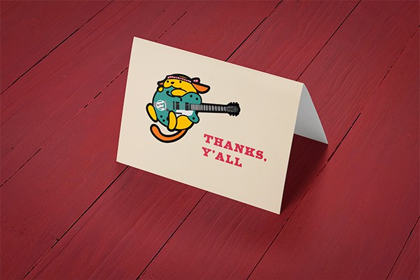
As a final touch, the lead organizer needed a branded thank you card to use in her follow-up communication with sponsors. We designed the perfect card, featuring the Wapuu and paired with a bright magenta envelope.
Whether you have a project in mind, need a speaker for an event, or just have a question — we'd love to hear from you.