


When we at Blustery Day Design do website projects for clients, they almost always include a brand extension.
Brand extensions for web are all about matching the feel and vision of your existing brand, while meeting the unique needs of websites as a medium.
You might find yourself wondering, “Why do we need to do branding stuff? We already have a logo!” But we see a few big reasons why including a brand extension in your project may be necessary.
First of all, as part of designing a website, we carefully craft the atmosphere of the site. Brand guidelines and extended color palettes still leave a whole world possibilities to narrow down.
For this task, we draw on the project’s discovery and content strategy work. Working together with the client, we choose a direction that takes into account the website’s specific goals and audiences.

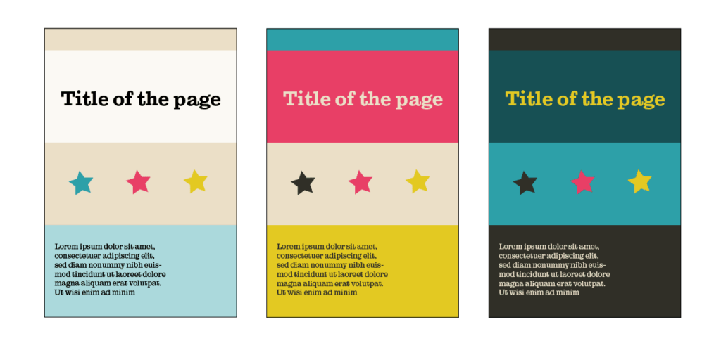
Secondly, things work differently online! If your logo & brand were originally developed for print use, your brand guidelines and options may not be complete enough to meet your website’s needs.
Colors that work well in print often display differently on bright monitors, so they need tweaking and creative thinking to “feel” on-brand while meeting accessibility standards.
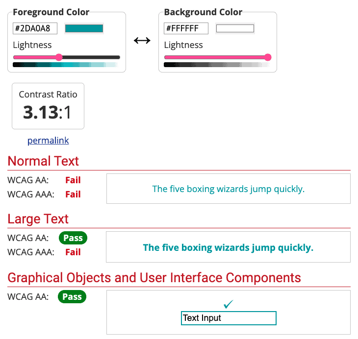
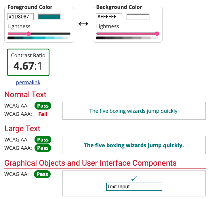
In the first example, you can see that the original brand color fails accessibility standards and does not have enough contrast with the white background. But a slightly tweaked version of the color passes — and still feels plenty on-brand.
Websites often need more colors, including tints & shades, for information hierarchy and clarity. Using a variety of colors intentionally can really help divide and display your information. The brand extension process makes sure we have:
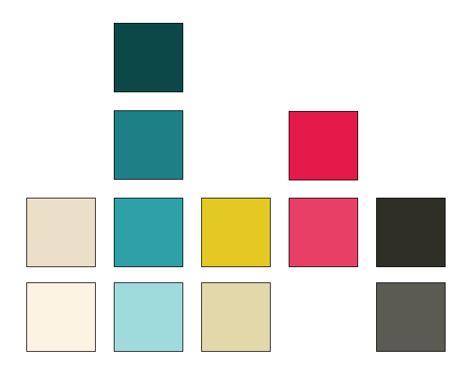
Some brands are already pretty colorful and only need additional neutrals. Other brands that are simple may need additional hues to meet all the website’s color needs.
For brands with very few colors, we can get creative. First we make some choices about if colors should be added, and if so, which colors.
Think of a simple brand like this, that comes with only two colors: black and green. Without adding any additional hues, we can use tints of the two colors for the neutrals we need. But… meh. This is pretty boring.


But if we choose to add hues to the palette, we have some fun choices to make. We go back to that initial content strategy work about what the company or organization truly represents, and then we choose colors that meet that vision.


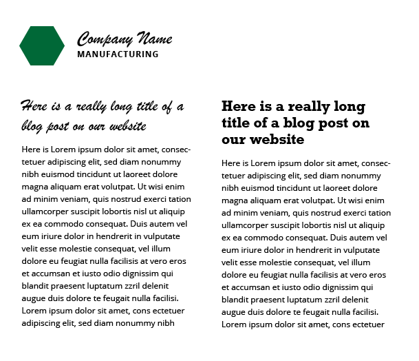
Next we look at typography. Brand guidelines often include typefaces chosen for print use, or designate the font used in the logo mark itself. Occasionally these fonts work well on the web. But often, they are too detailed or too hard to read online.
Because monitors use pixels to form the letters, simpler, web-ready typefaces are often more legible. So we find complementary fonts that “feel” on-brand, while also meeting readability requirements.
And finally, we’ve seen countless times the value of doing this work upfront! If we don’t extend the brand intentionally for web use… it will be extended anyway over time (just not intentionally). Setting good standards and making decisions before the site goes live ensures that the website stays consistent! And that as different staff work on the site into the future, they will have good precedents to follow and will know just what to do.
Top photo by Jess Bailey on Unsplash.